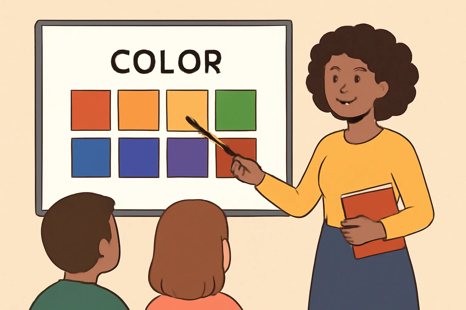
Color is more than a decorative element in education. In the context of color theory, classrooms can become laboratories for visual thinking, scientific inquiry, and creative problem solving. The goal of teaching color in a structured way is not merely to memorize color names or palettes, but to cultivate a transferable set of skills: recognizing how color behaves under different lighting, understanding how viewers perceive color, and using color intentionally to communicate ideas, emotions, and information. This article outlines effective classroom techniques for teaching color theory across ages and disciplines, with practical activities, accessible practices, and strategies for assessment and reflection. By presenting multiple approaches—hands-on experimentation, digital exploration, and cross-disciplinary integration—teachers can address diverse learning styles while maintaining a coherent throughline: color is a powerful tool for thinking and communicating.
Foundational concepts students should master
Color models and spaces
To build a solid foundation, learners should become familiar with the main color models and how they differ. An effective curriculum introduces these models in context, linking them to real-world applications in art, design, science, and technology.
RGB (Red-Green-Blue): An additive color model used for digital screens. Colors are created by light, and mixing increases brightness until white is achieved. Students can observe how primary colors of light combine to produce a wide range of hues.
CMYK (Cyan-Magenta-Yellow-Black): A subtractive color model used in printing. It explains why printed pages may appear differently from what’s seen on screens, and why color calibration matters in publishing.
HSL/HSV (Hue-Saturation-Lightness/Value): A perceptual model that maps color properties in intuitive terms. Teachers can use wheel-based activities to demonstrate how changing hue, saturation, or lightness affects mood and readability.
Lab color space: A perceptually uniform color model that can help students understand how colors relate in a way that aligns with human vision. This model is especially helpful in discussions about color distance and accessibility.
In addition to naming these models, students should practice translating colors between spaces. A practical exercise might involve selecting a color in RGB, converting it to CMYK for print, and discussing how the look changes when displayed on a screen versus printed materials. This grounding helps students understand why color choice matters in different media.
Color relationships and harmony
Color relationships provide a framework for designing with intention. A common and effective approach is to explore palettes based on known harmony rules, paired with opportunities to experiment and challenge assumptions.
Complementary colors sit opposite each other on the color wheel and create high contrast. They are useful for callouts, emphasis, and dramatization in visual work.
Analogous colors sit next to each other on the color wheel and yield harmonious, cohesive palettes often found in nature and branding.
Triadic and tetradic schemes use evenly spaced hues to achieve balance and energy, suitable for bold artworks and dynamic interface design.
Split-complementary and other variations offer high contrast with reduced tension, a practical option for classroom beginners who want more flexibility than pure complementary schemes provide.
Engage students in exercises where they identify palettes in artwork, analyze how color relationships influence mood, and then recreate or remix those palettes in their own projects. Emphasize that color harmony is a tool, not a rule—students should learn when to follow conventions and when to bend them for expressive purposes.
Color dynamics: tint, shade, tone; temperature; saturation
Beyond hue, color dynamics determine how color communicates information. Teaching these concepts helps students modulate mood, readability, and clarity in their work.
Tint, shade, and tone describe lightened, darkened, or desaturated variations of a color. These values affect readability and depth in composition.
Color temperature (warm vs. cool) influences the perceived mood and energy of an artwork or design. Warm tones are often associated with activity and urgency, while cool tones can suggest calm or precision.
Saturation reflects color intensity. High-saturation colors command attention, while desaturated colors recede into the background and support legibility.
Hands-on activities, such as painting gradients or digital tasks that adjust temperature and saturation, help students observe how subtle changes alter meaning. Encourage students to justify their decisions by describing why a particular tint, shade, or temperature might support a specific audience or function.
Classroom techniques and activities
Hands-on color mixing and paint activities
Experiential learning is especially effective for color theory. Concrete, tactile activities give students an embodied sense of color relationships and light behavior. A well-planned sequence might include the following steps:
Primary color experiments: Have students mix primary pigments to discover secondary colors, then compare these results with digital color mixing. Document observations about opacity, pigment behavior, and the difference between perceived color and pigment color.
Color harmony station: Provide swatches and a shared color wheel. Students create two or three color schemes (analogous, complementary, triadic) for a given theme and then critique which scheme communicates the theme most effectively.
Light and shadow trials: Use white light sources and colored overlays or gels to explore how light affects color perception on different materials (paper, fabric, plastic). Encourage students to record how color changes across surfaces and angles.
Accessibility checks: Have learners test color combinations for contrast on printed material and screen displays, noting which combinations remain legible for people with typical or reduced color vision.
To maximize engagement, rotate students through stations, provide guiding questions, and invite peer feedback. End with a debrief that connects the experiences to the foundational concepts of hue, value, and saturation.
Paper and pigment exercises
Low-tech activities help build intuition about color behavior without the distractions of digital tools. Consider these activities:
Color mixing with printmaking: Explore transparency by layering colored papers and seeing how overlays change perceived color and brightness.
Material properties: Compare how different media (watercolor, acrylic, marker) render the same color swatch, focusing on pigment opacity, streakiness, and granularity.
Value scales: Create value scales from pure white to black by tinting colors and observe how the change in value affects readability and emphasis.
Texture and color: Experiment with how texture affects color perception, such as dry-brush versus smooth surfaces or matte versus glossy coatings.
Digital color exploration
Digital tools let students manipulate color precisely and visualize relationships quickly. Build digital activities that emphasize the connection between theory and application:
Color wheel navigation: Students identify harmonious palettes by dragging hues around a wheel, then explain why certain schemes work for a given design brief.
Contrast and accessibility simulations: Use built-in accessibility checkers or contrast simulators to evaluate whether text is legible against backgrounds for different user profiles (e.g., color vision deficiency simulations).
Brand or poster design challenges: Create a poster using a limited palette, then evaluate how the color choices convey the intended message, target audience, and tone.
Cross-media projects: Compare color choices across digital slides, printed handouts, and formative assessments to illustrate media-specific color considerations.
Inclusion, accessibility, and color vision
Design accessible color palettes
Equity in color education requires planning for diverse learners, including those with color vision differences. Teachers can model inclusive practices by:
Choosing palettes with sufficient contrast for readability, especially for text and important data visualizations.
Using text labels in addition to color cues to convey information. Relying on color alone can exclude some students from understanding key concepts.
Providing texture, patterns, or shapes as additional identifiers alongside color in charts, maps, and diagrams.
Offering alternative tools or modes (e.g., grayscale versions, high-contrast themes) for students who benefit from different visual experiences.
In practice, teachers might require that every color-coded element also include a label or pattern. For example, in a data visualization assignment, students could mark each category with both color and a unique icon or texture to ensure accessibility without sacrificing design clarity.
Color blindness affects a notable portion of the population, and thoughtful instruction helps all students engage with color concepts without bias. Strategies include:
Using color-agnostic explanations—focus on concepts like hue, value, and saturation independent of any single color. Encourage students to speak in terms of color families rather than specific hues when possible.
Incorporating alternative cues such as labels, textures, or patterns in graphs and charts so that meaning is conveyed beyond color alone.
Providing color vision simulations in the classroom to help all students understand how accessibility concerns affect interpretation of color-based information.
Encouraging students to design with robust contrast and to test their work with tools that simulate color-vision deficiencies, ensuring legibility across audiences.
Assessment and feedback strategies
Formative and summative approaches
Color learning benefits from a combination of ongoing checks and culminating demonstrations. Consider a mix of these methods:
Observation notes: Document students’ strategies as they work with color, noting their rationale for choices and how they respond to feedback.
Rubrics for color projects: Create criteria that assess understanding of color models, harmony, contrast, accessibility, and the ability to justify design decisions.
Self-reflection prompts: Have students articulate what color choices communicated, what worked well, and what could be improved in terms of readability, mood, and audience impact.
Peer critique: Structured feedback sessions where students critique each other’s palettes and explain the intended effects and potential ambiguities.
Complex assessments help demonstrate transfer of color knowledge beyond theory. Examples include:
Design brief: Students respond to a real-world scenario (e.g., creating a poster for a school event) with a color strategy that supports the message and accessibility requirements.
Cross-media portfolio: A portfolio that includes color exploration across at least three media (digital, print, and environmental or physical product), with annotations describing color choices and outcomes.
Scientific visualization: Students create color-enhanced charts or models to present data, articulating how their color choices aid comprehension and minimize misinterpretation.
Cross-disciplinary integration
Linking color theory to art, science, and math
Color science thrives at the intersections of disciplines. A thoughtful curriculum weaves color into multiple subjects, enriching understanding and demonstrating relevance.
Art and design: Deepen explorations of composition, emotional impact, and branding, while grounding practice in color science principles.
Science and perception: Connect color to optics, light, and human vision. Use experiments that reveal how wavelength, intensity, and context alter perception.
Mathematics and data visualization: Teach color scales, color ramps, and perceptual uniformity to improve accuracy and interpretation in graphs and models.
Language and culture: Explore how color communicates meaning across cultures and how linguistic descriptors influence color categorization.
Project ideas that fuse disciplines
Practical, classroom-ready projects can span grade bands and subject areas:
Science poster: Students design a poster that communicates a scientific concept using color to indicate variables, intensities, or data categories, with a focus on accessibility.
Historical color palettes: Investigate color usage in different art periods or media technologies, then recreate a piece using historically informed palettes and modern constraints.
Coding and color: In introductory programming tasks, learners generate color palettes programmatically, manipulating HEX or RGB values to produce accessible UI components.
Resources, materials, and classroom management
Materials and setup
A well-stocked color education station supports independent exploration and collaborative learning. Suggested materials include:
Color wheels for quick reference and experimentation
Physical pigments (paint, colored papers, overlays) and whiteboards to capture ideas and visualize relationships
Digital devices with color tools, palettes, and contrast simulators
Printed handouts with examples of palettes, guidelines for accessibility, and prompts for analysis
Pattern blocks or textures for exploring color- texture-color interactions in tangible form
In digital environments, teachers can guide students through structured tasks while allowing autonomy in exploration. Useful approaches include:
Providing a curated set of color palettes for different projects, along with a rationale for each choice
Using color contrast calculators to evaluate legibility in slides and handouts
Encouraging students to document their design decisions with brief annotations
Facilitating peer review sessions focused on color communication and accessibility
Practical classroom design and scheduling tips
Building a coherent color curriculum
To maximize retention and transfer, align color activities with clear learning targets and repeat core concepts across units. A suggested structure:
Begin with foundational vocabulary (hue, value, saturation, contrast) and color models
Progress through color relationships and harmonic schemes
Introduce color in context—media design, scientific visualization, and data storytelling
Incorporate accessibility and ethics (color usage, biases, inclusivity) into every project
Scheduling flexible activities
Not all students learn color in the same way, so provide diverse modalities and allow for flexibility:
Short, focused warm-ups that present a color puzzle or a quick palette critique
Longer, project-based units that require color decisions aligned with a design brief
Regular formative checks to adapt instruction based on student growth and misunderstandings
Common misconceptions and how to address them
Misconception: Color always equates to mood
While color can convey mood, it does not do so in isolation. Perception is context-dependent, and cultural associations influence color meaning. Address this by:
Encouraging students to articulate why a color choice supports a message, audience, and context
Having students investigate and present multiple cultural interpretations of a single color
Providing opposite or nuanced examples where color mood is counterintuitive or subverted for effect
Misconception: Bright colors are always better for attention
Brightness attracts attention, but readability and overall comprehension depend on contrast, spacing, and typography. Mitigate this by:
Comparing slides or posters with different levels of brightness and contrast
Demonstrating where high-contrast palettes improve legibility and where too much brightness overwhelms the eye
Building a culture of reflective color practice
Reflection routines and ongoing discourse
Color education thrives when students reflect on what they’ve learned and why it matters. Consider incorporating:
At the end of each unit, a brief written reflection on color choices and their effects
Gallery walks where students explain their color decisions and gather peer feedback
Journals that track personal growth in recognizing color relationships and applying color theory to new contexts
Professional development and collaboration for teachers
For sustained impact, teachers should collaborate to curate best practices, share example palettes, and review student artifacts. Approaches include:
Peer observation focused on color instruction strategies
Joint planning sessions to align color units with other subjects (e.g., science vocabulary or math graphing conventions)
Participation in workshops or online communities that explore accessible color design and inclusive pedagogy
Conclusion: The enduring value of teaching color thoughtfully
Teaching color theory in the classroom is not about mastering a single toolbox of tricks; it is about cultivating a vocabulary for seeing, a rigour for reasoning, and a sensitivity to audience and context. By weaving foundational concepts—color models, harmony, and dynamics—with hands-on activities, accessible practices, and cross-disciplinary applications, educators can help students become deliberate color thinkers. The most effective color education blends theory with practice, emphasizes accessibility and inclusion, and invites students to explore how color shapes perception, communication, and problem solving in the real world. When students understand not only what colors are, but why they work the way they do, they gain a transferable advantage in any field that relies on clear, compelling visual communication.
Conducting is the art of translating musical intention into visible, precise, and expressive movements. For beginners, the goal is to establish a clear internal pulse, communicate dynamics and articulation, and cue entrances with confidence. This comprehensive guide focuses on basic conducting techniques that form the foundation for effective rehearsal and...
Overview of baptism graphics for church projects In church communications, baptism graphics serve as a powerful visual language that reinforces spiritual meaning while guiding congregants through events and programs. From weekend announcements to printed bulletins, from website banners to on-screen slides, carefully chosen and well-crafted SVG assets can unify a...
What are Jesus colouring pages and why they matter Jesus colouring pages are printable images designed for children to color while they learn about the life, teachings, and message of Jesus Christ. These pages come with outlines or simple line drawings that families, teachers, and churches can print at home...
Introduction: The Art of Tea and the Matcha Set The art of tea matcha set is more than a collection of utensils; it is a doorway into a mindful, ceremonial approach to preparing and enjoying one of the world’s most iconic beverages. Whether you are a curious beginner, a home...